During my time working at Central Connecticut State University's Student Activities / Leadership Development department, I was given the opportunity to design countless social media posts and advertisements for various events around campus. Knowing the tone of each event and matching the style of the post to each request took a lot of careful planning and research.
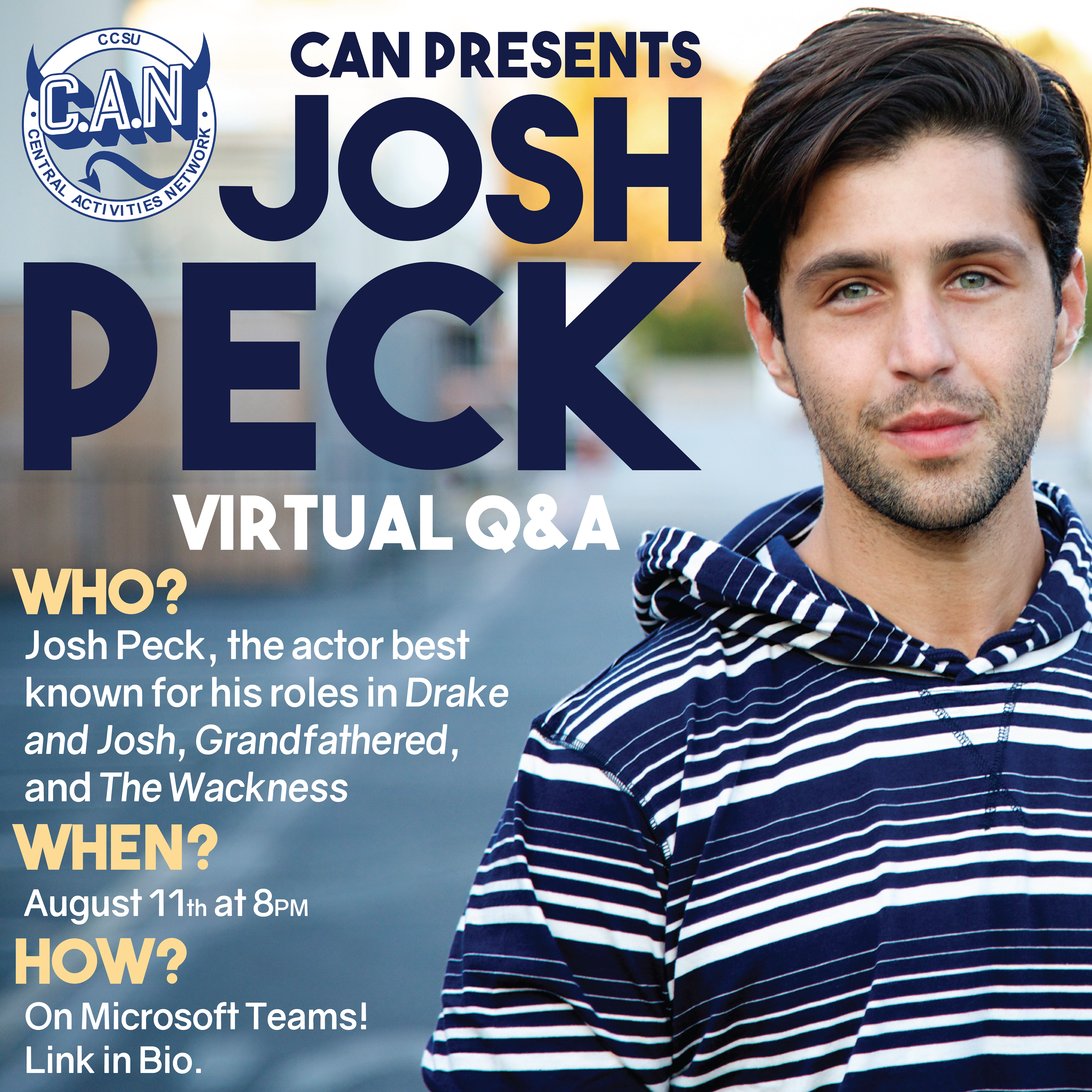
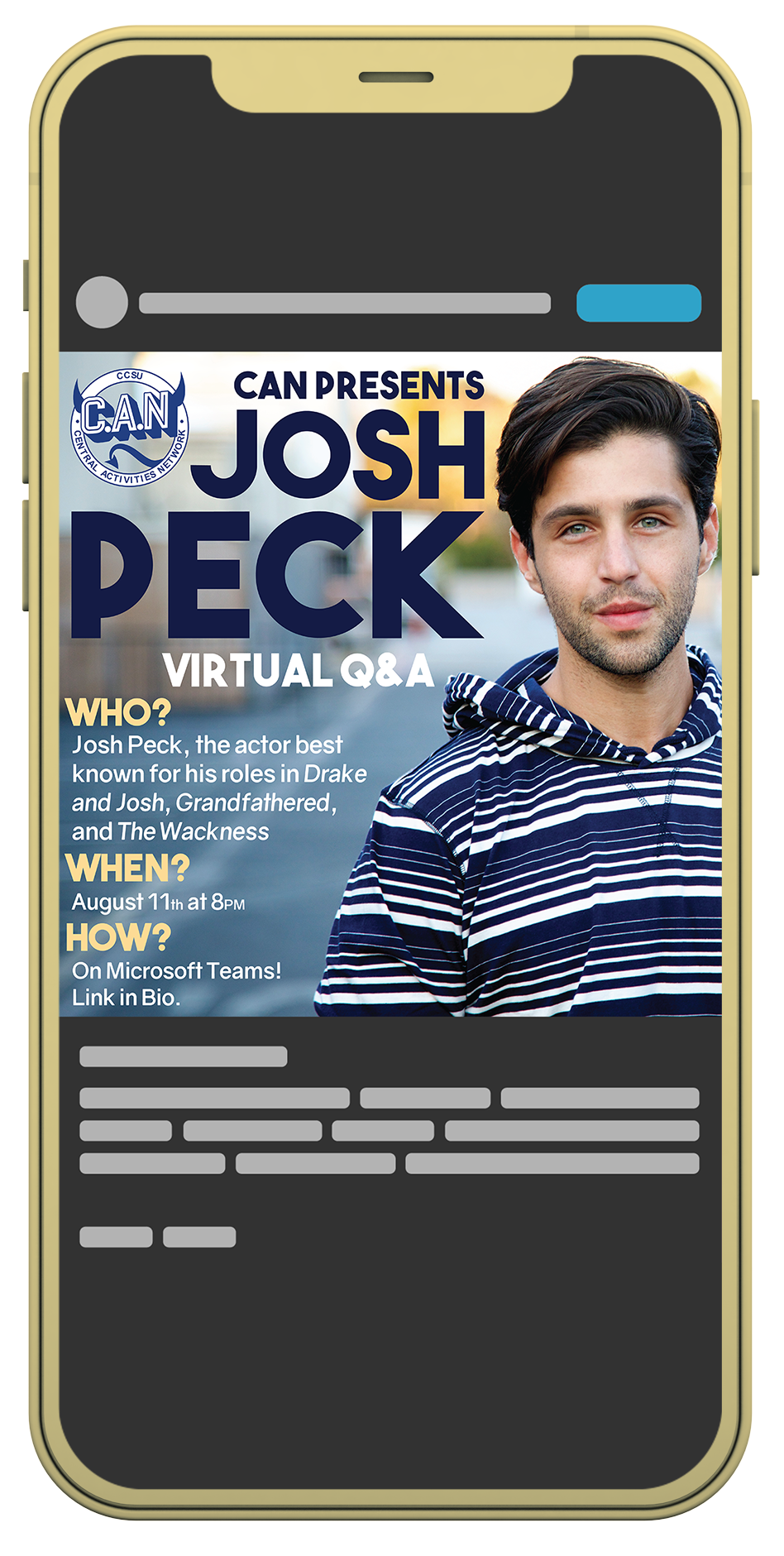
One of the projects I was most excited to work on one the social media for a virtual Q&A held by actor/comedian Josh Peck. Growing up, I was an enormous fan of his work in the classic TV series Drake & Josh on Nickelodeon, so working on an official post for his event was a huge experience for me. I was given the chance to design something for a personality that I have been a fan of for my entire childhood. As a designer, I was totally thrilled to be a part of this event in some way.
To begin the design, I took a good look at the approved photography I had to represent him. I looked at the colors that he was wearing or in the background to try to find a solid color palette. I chose the shade of navy blue in his hoodie for the header text, and then white for the body text to match the stripes in his hoodie. For a secondary header text I chose a light yellow/gold color, as it was in a similar color group to the background of the image and it was a great contrasting color to the dark blue.
Moving forward, I was careful to select bold and readable typefaces, as I knew there was a good amount of information I needed to include and I didn't want to lose the bold minimalist legibility of the post. To make the text a little more legible, I made sure to align the text over some dead space in the photograph, where there wasn't a lot going on and minimal colors. Being aware of the color choices and legibility of the text allowed me to fully realize and create a very successful social media post for Josh Peck's event on campus.
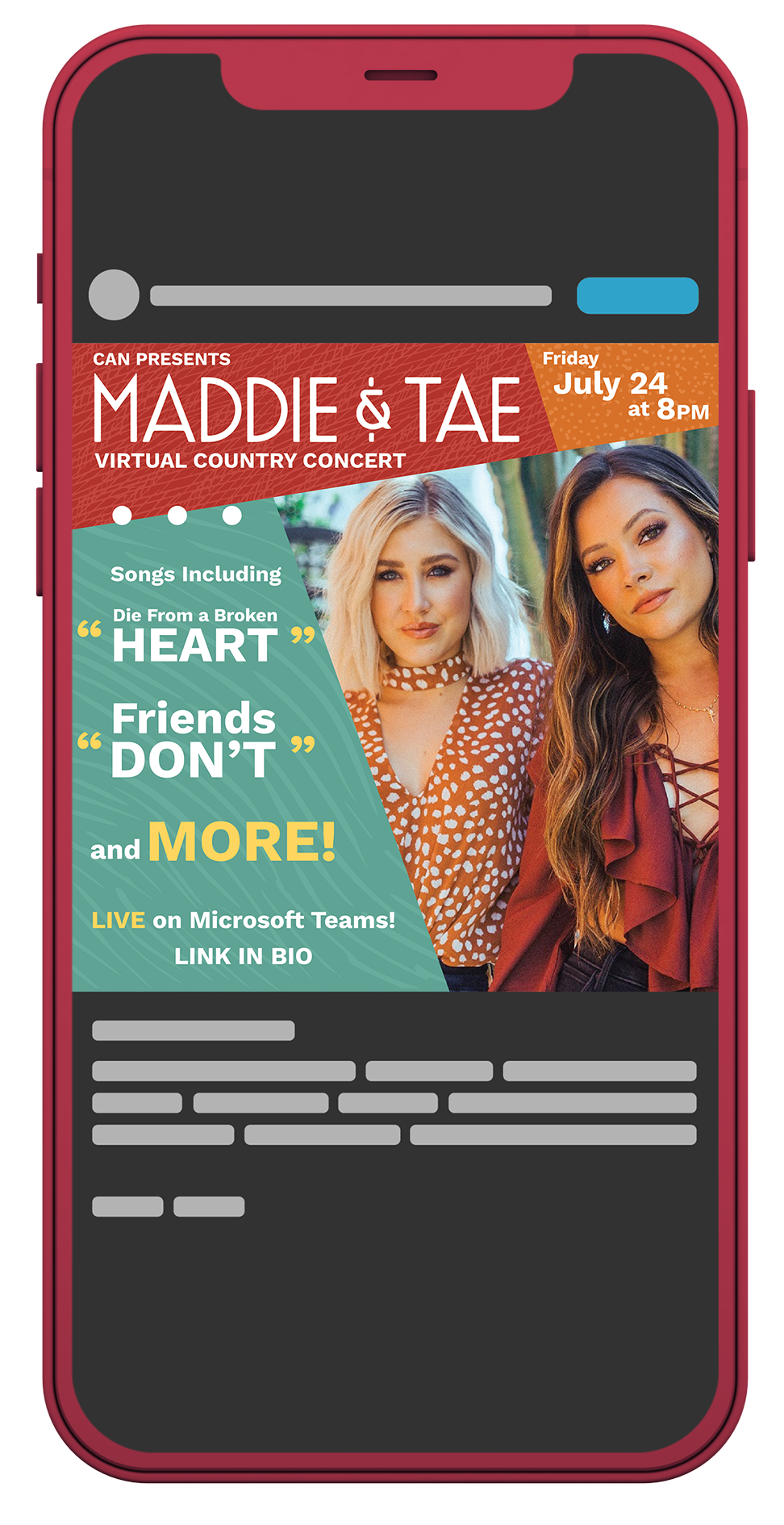
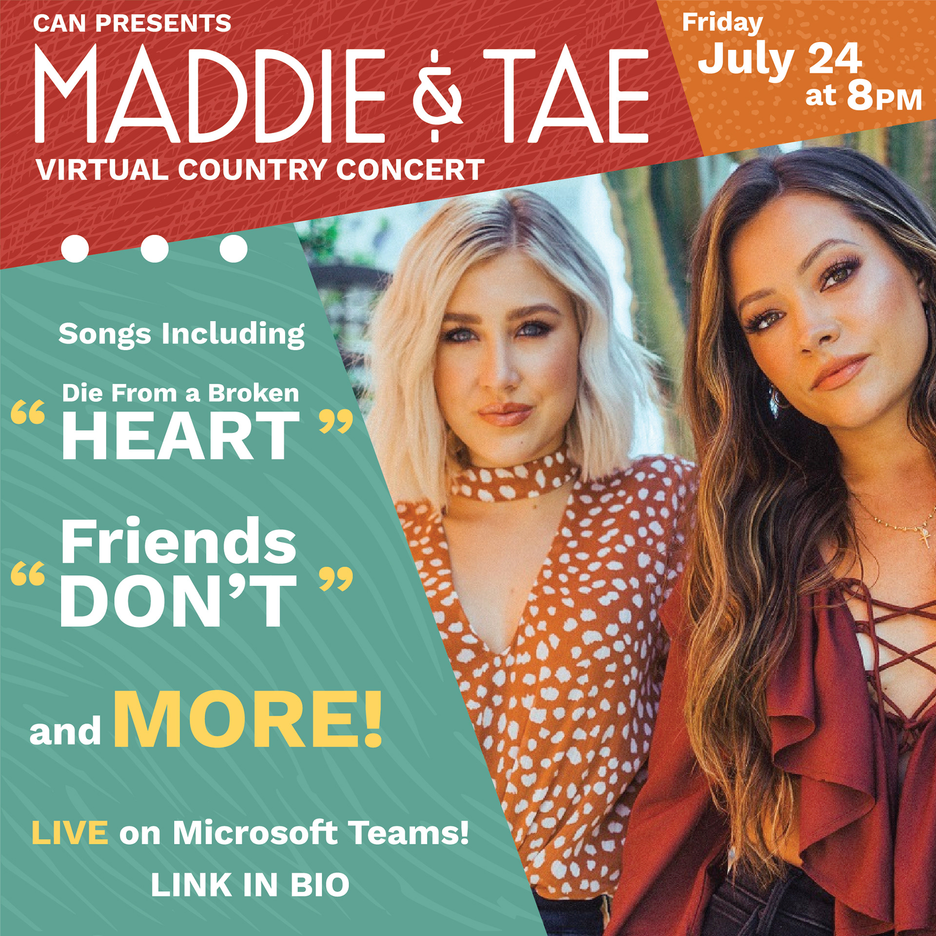
Another project I was very stoked about was a virtual concert social media campaign for country artists Maddie & Tae. This was the first time that I was given the opportunity to do work for people that weren't just a big deal on campus or in my home town, but people that were well known across the country. Maddie & Tae are very successful musicians, and prior to working for the school I had only ever really created projects for fictional companies or clubs around the university. I wanted to make sure to perfectly match their brand and style with these posts, and I knew right away that nailing the colors and country style was crucial to the success of this advertisement.
I pulled colors straight from the image for this post. The warm red from Tae Dye's shirt, the burnt orange from Maddie Marlow's spotted top, and a cool green from the background. This color palette went together flawlessly, with the red and orange being analogous colors and the green contrasting with such grace and beauty. I mimicked the spots in Maddie's shirt for the texture in the orange block, I used a leather texture for the red block, and some loose flowing linework for the texture in the green block. These textures helped break up the visual monotony of the color blocks in a subtle and effective way that I really appreciated. All of these colors worked perfectly with white text, so constructing the informational portions of the post came easily and naturally.
Near the end of Maddie & Tae's virtual concert, they gave me an excited and passionate shout out for handling their social media, which as an entry level designer I was very excited about. It showed me how much a brand can matter to people, and how connected the designer can be to the client just through the work they do.
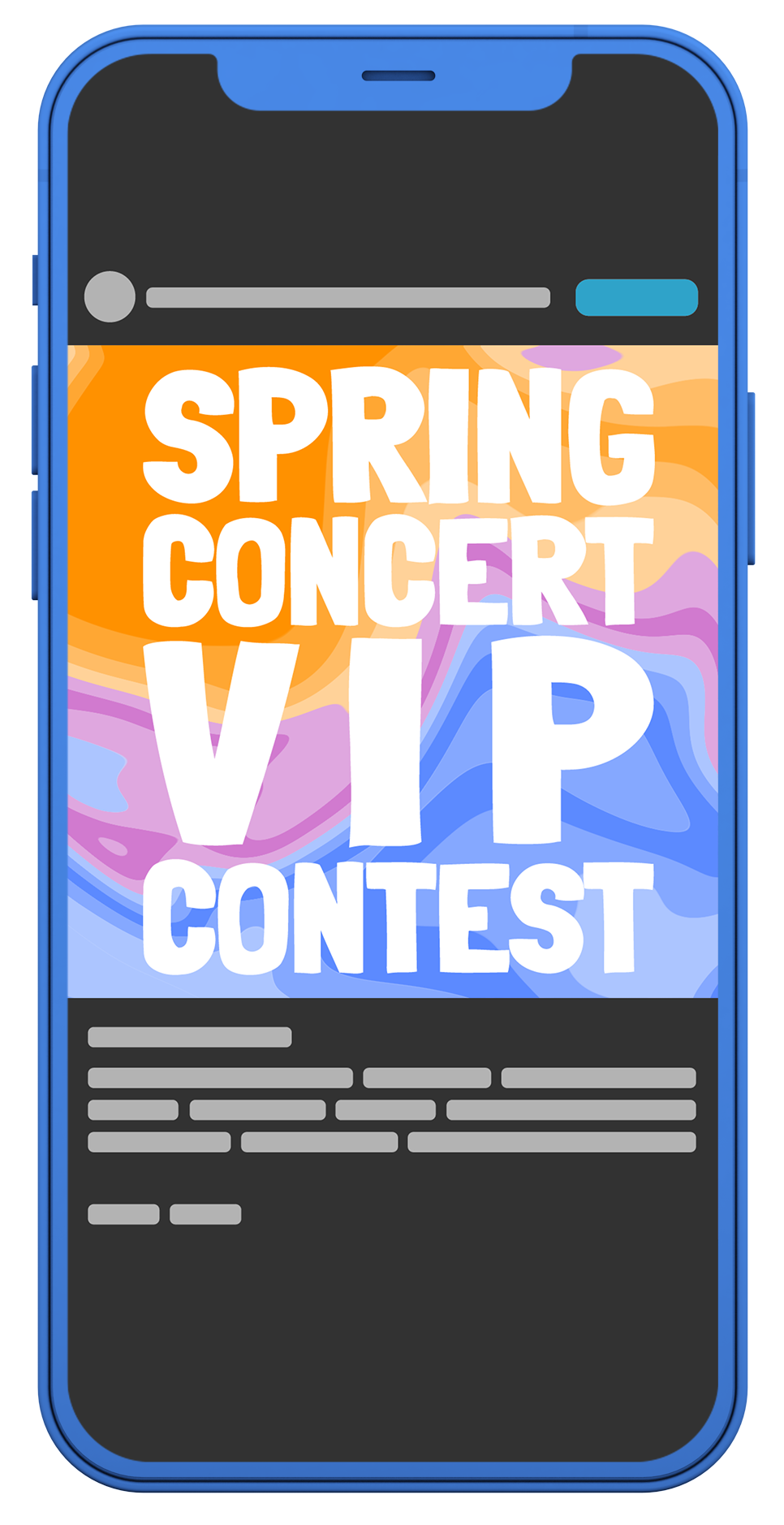
This piece was very different than the previous two I've shown, as it was not focused on delivering information as much as grabbing the attention of viewers scrolling through their feed. I wanted to make this post pop as much as possible, grabbing people's attention and prompting them to continue scrolling through the post or check out the description. This is just as important on platforms like Instagram, Twitter, or Facebook as delivering informational posts. The simple fact is if people are scrolling through their Instagram feed, seeing picture's of their friend's cat or their Aunt's vacation photos, a bright colorful image with huge bold type will grab their attention more than a subtle small professional looking post.
When designing this piece, the only request was that I used some sort of marble background. I began researching what makes these types of images successful, looking at color relationships and visual styles. I tried a few realistic marbled paint images or marble counter top photos, but none of them were working as well as I would've liked. I spent some time learning how to create that effect using vector images and solid colors in Illustrator and Photoshop, and I couldn't be happier with the result. I created a sharp and bold marble background without it being too visually busy to read anything on screen. I then worked with a bold typeface and some stacking techniques to create an eye-catching and exciting title slide for this Instagram post. After all, we wanted people to get involved and be interested in it. Highlighting words like "VIP" and "CONTEST" will lead people to think they can get something out of looking into this post, therefore leading them to get involved.
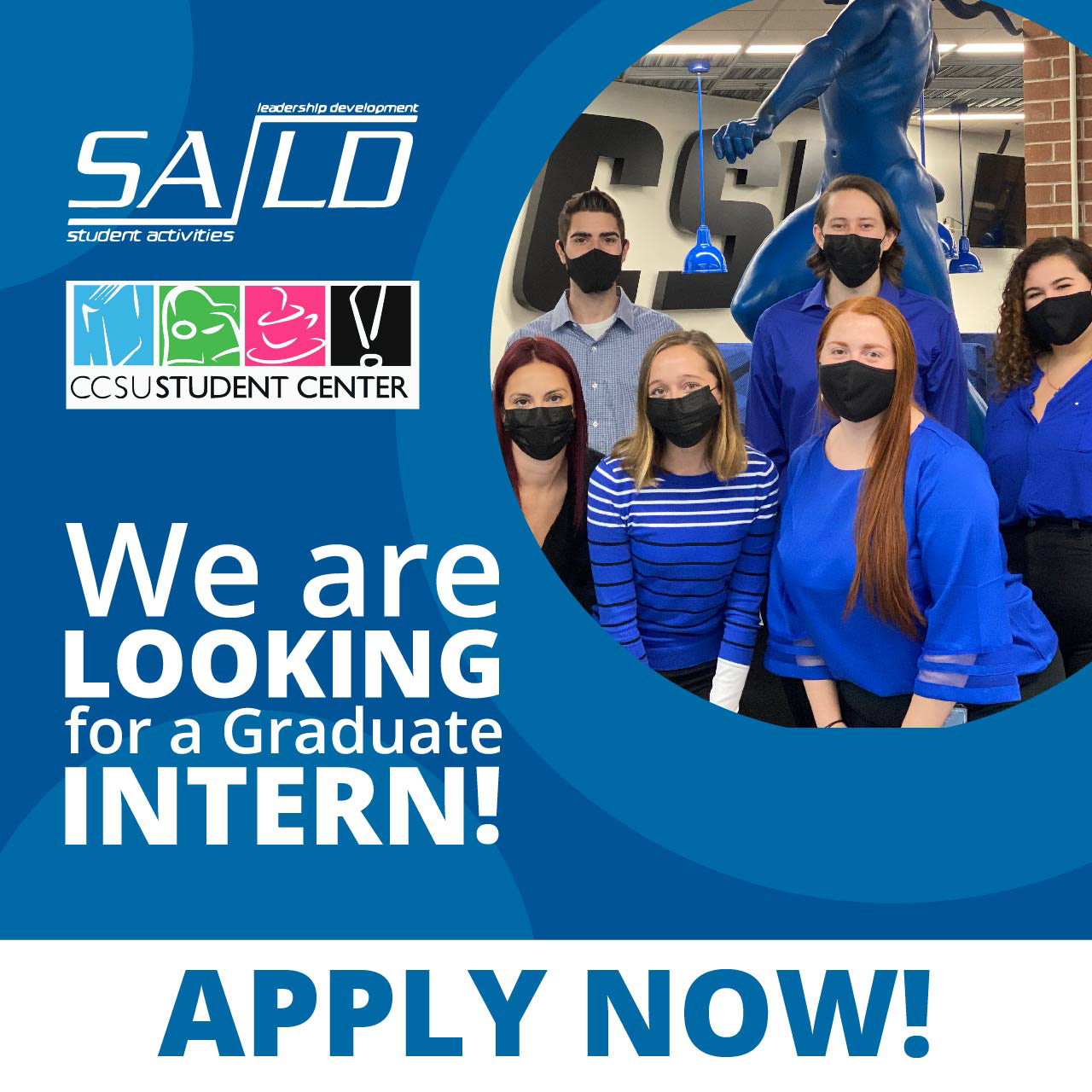
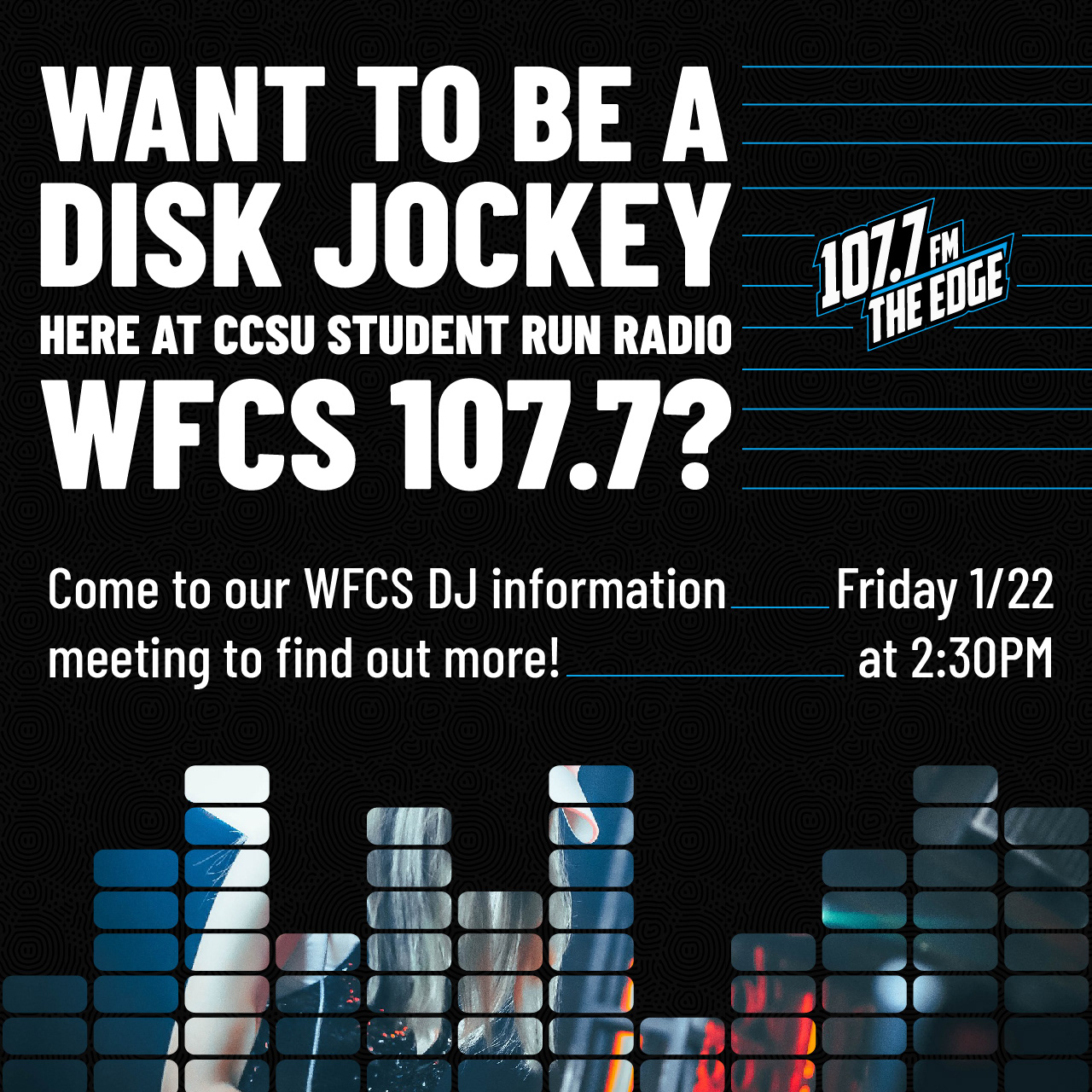
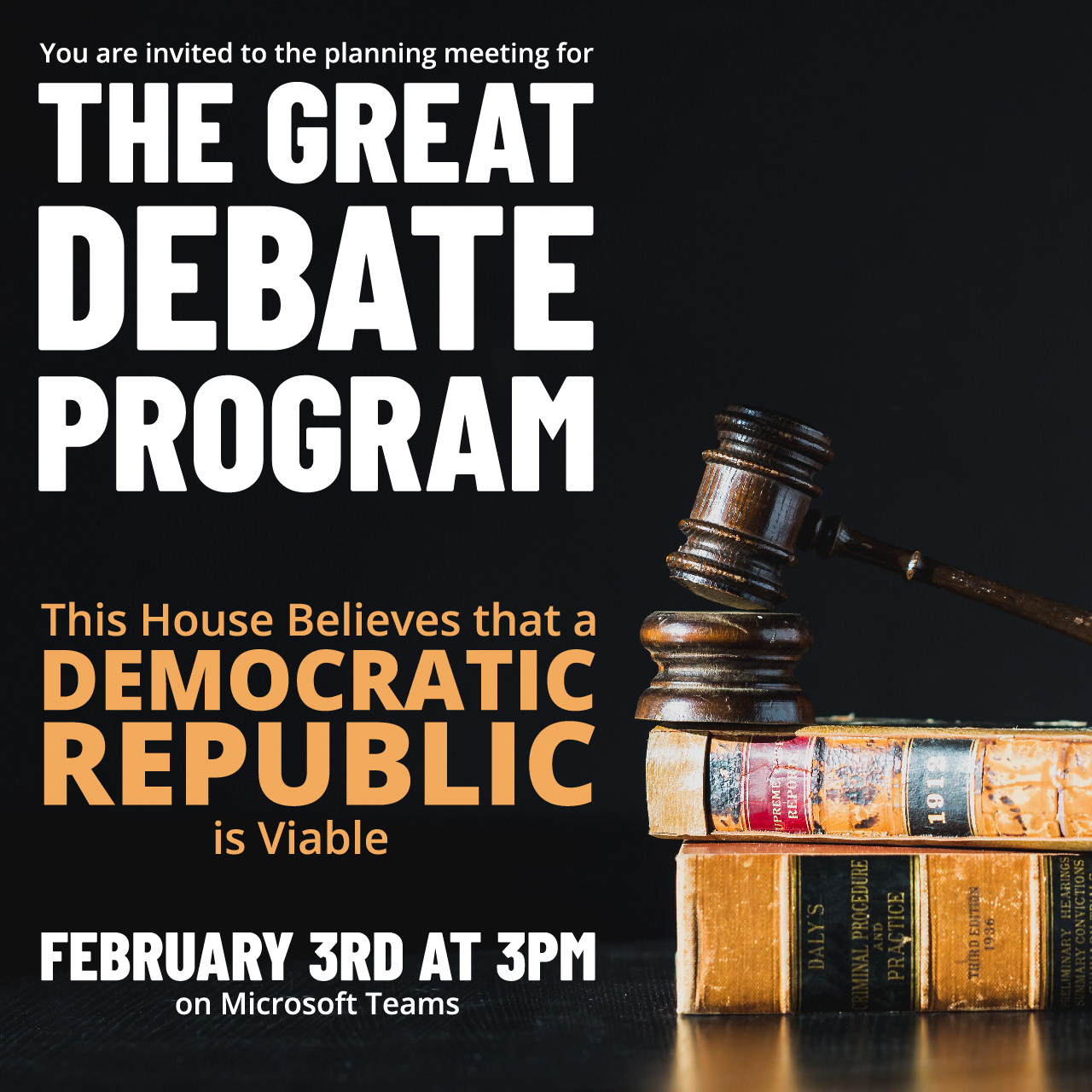
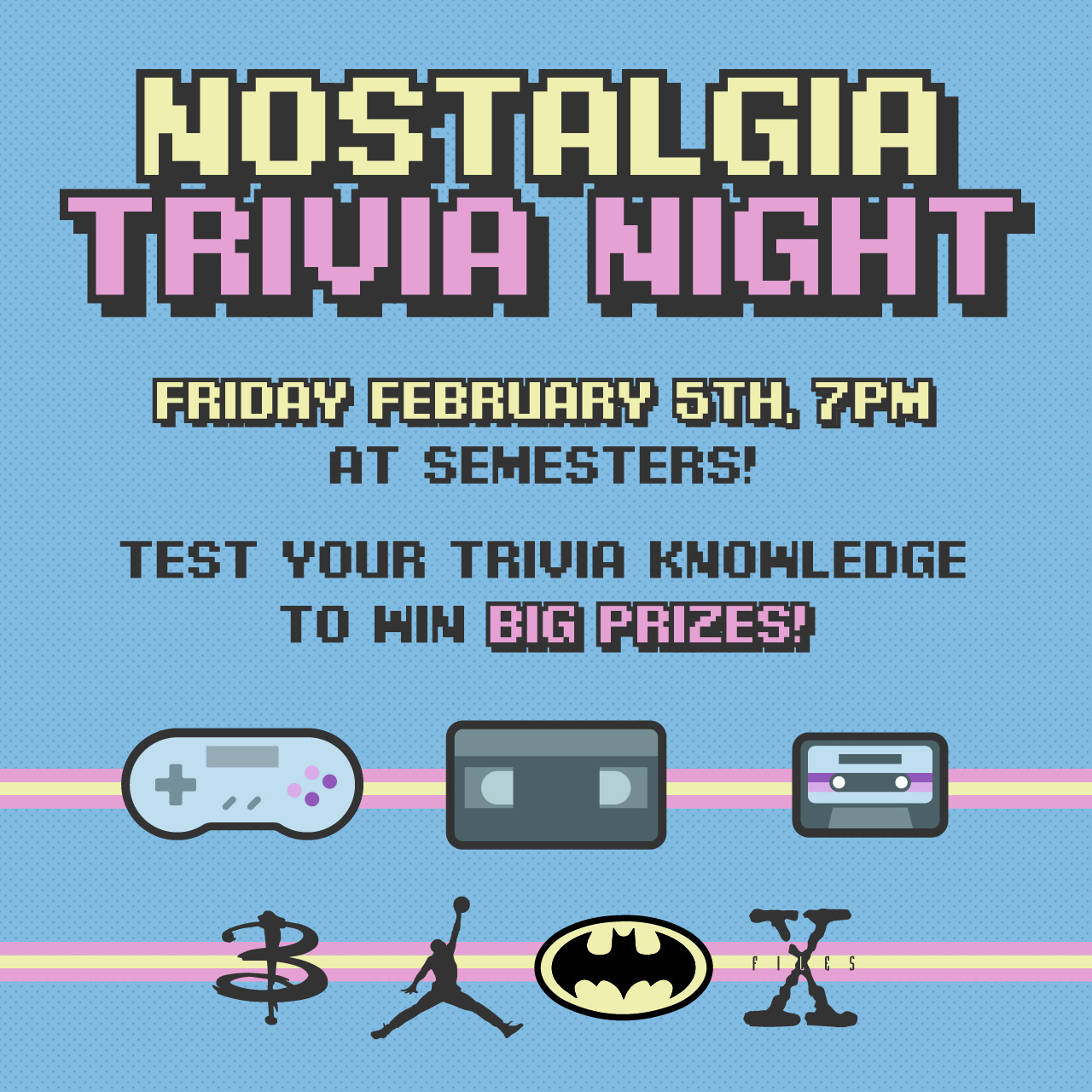
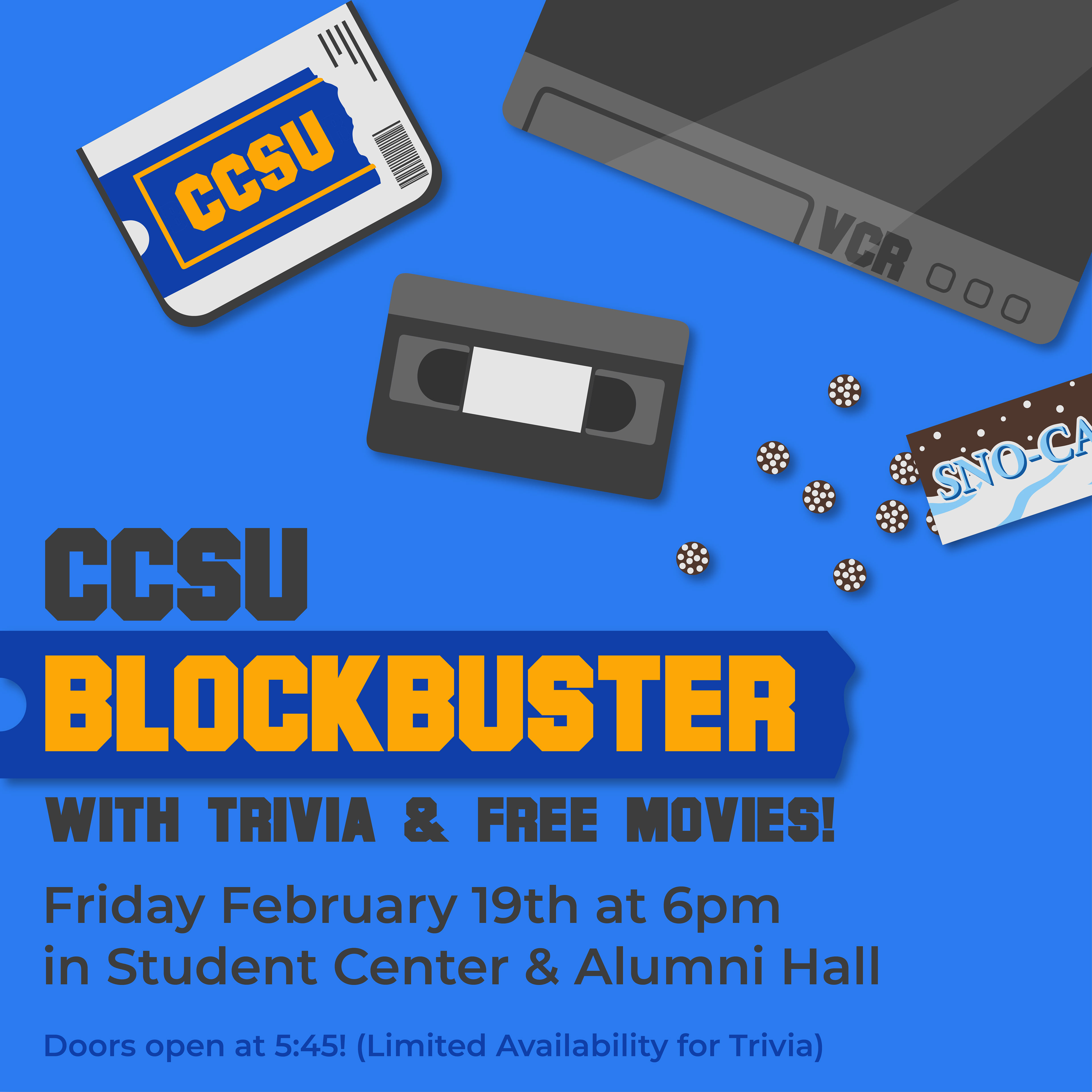
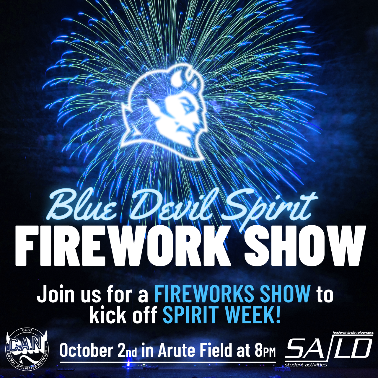
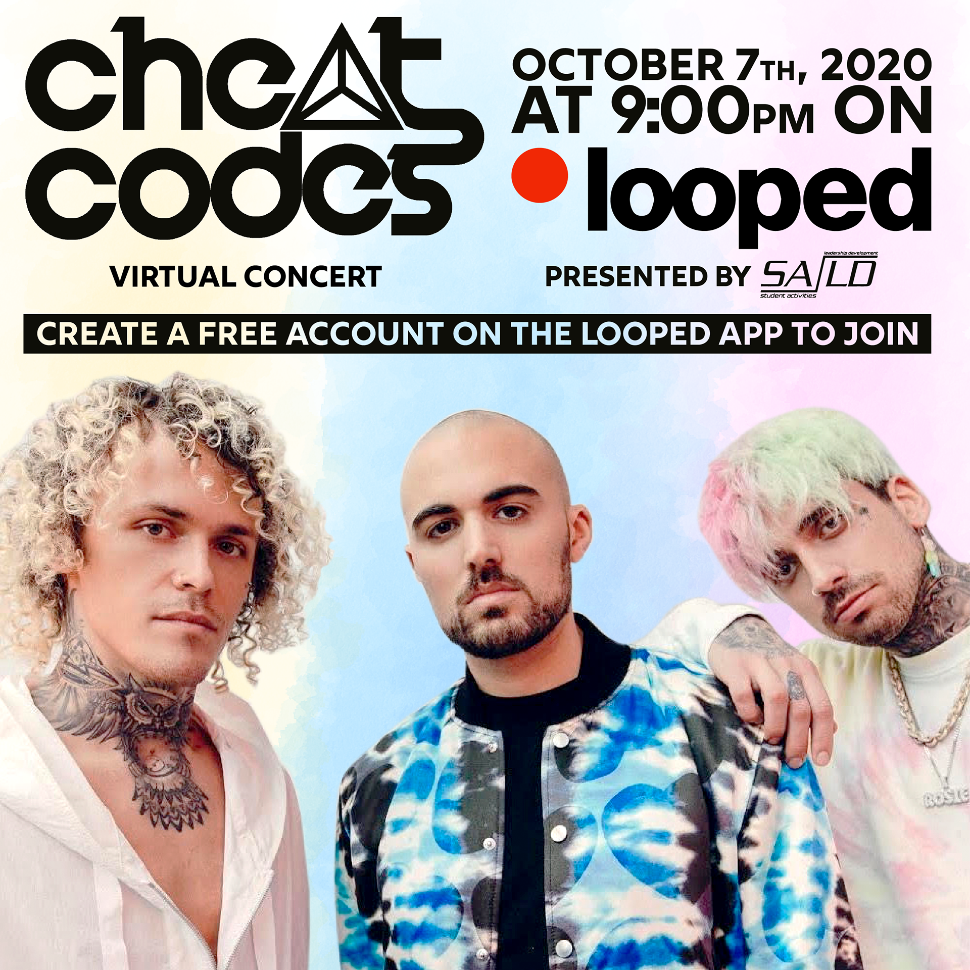
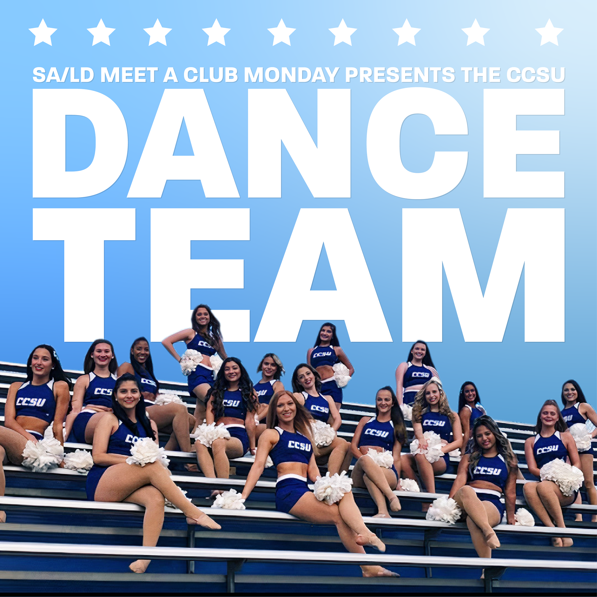
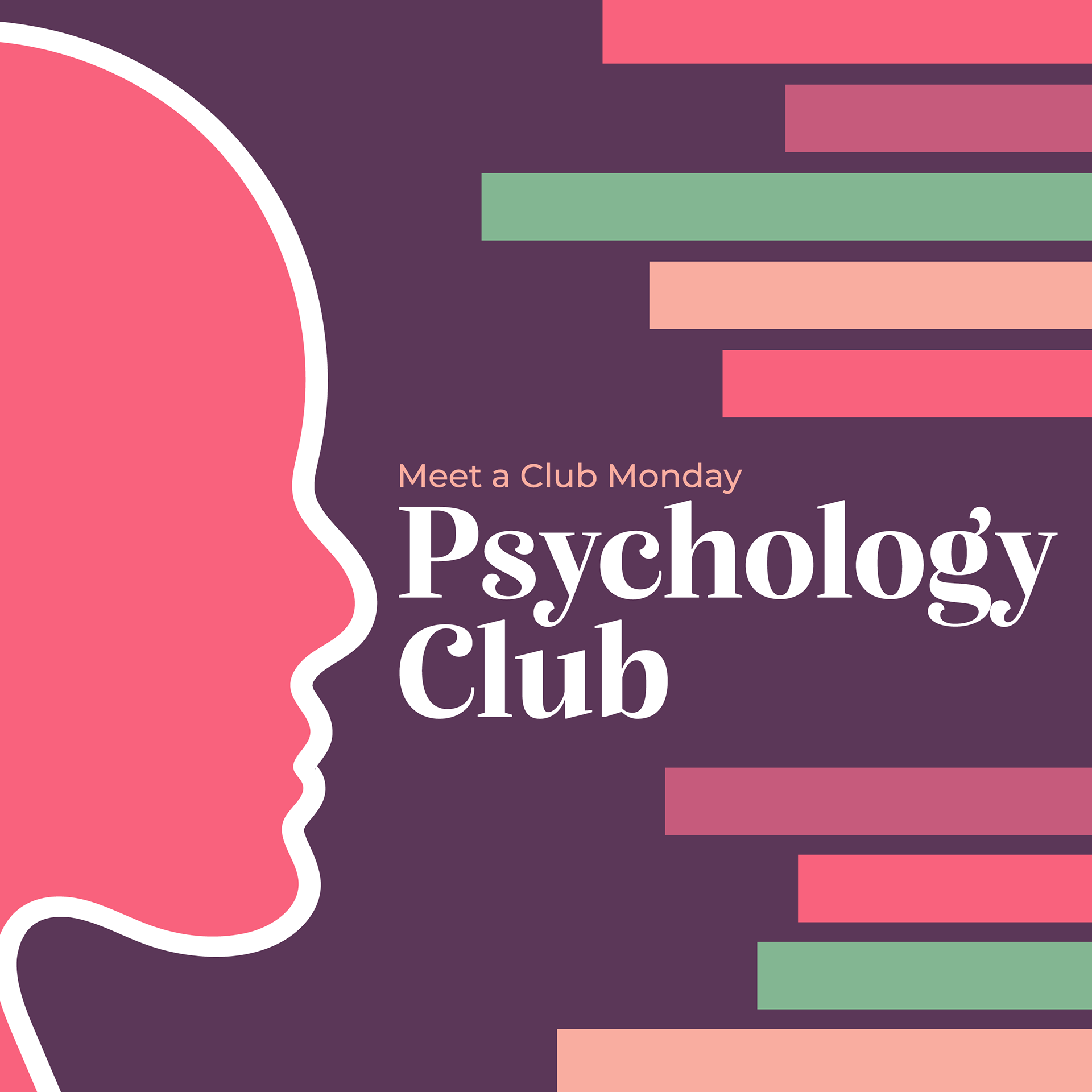
Below I have listed a number of different social media posts I've done for events around campus at CCSU in no particular order. I selected these posts as they show a wide range of the type of work I was given the opportunity to do during my time working at the Student Activities / Leadership Development department.