
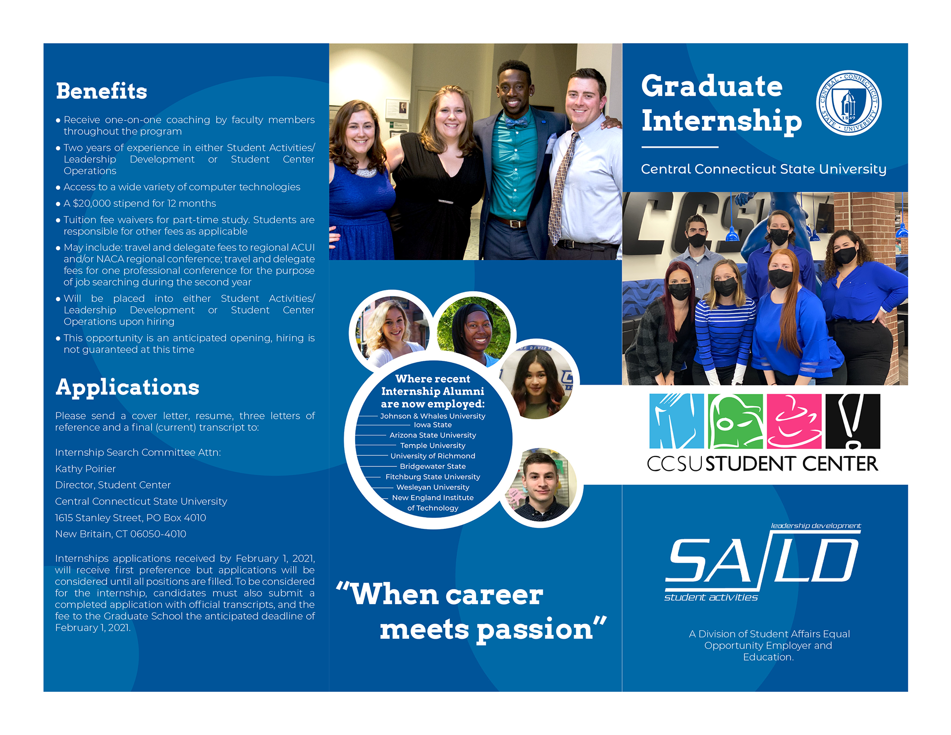
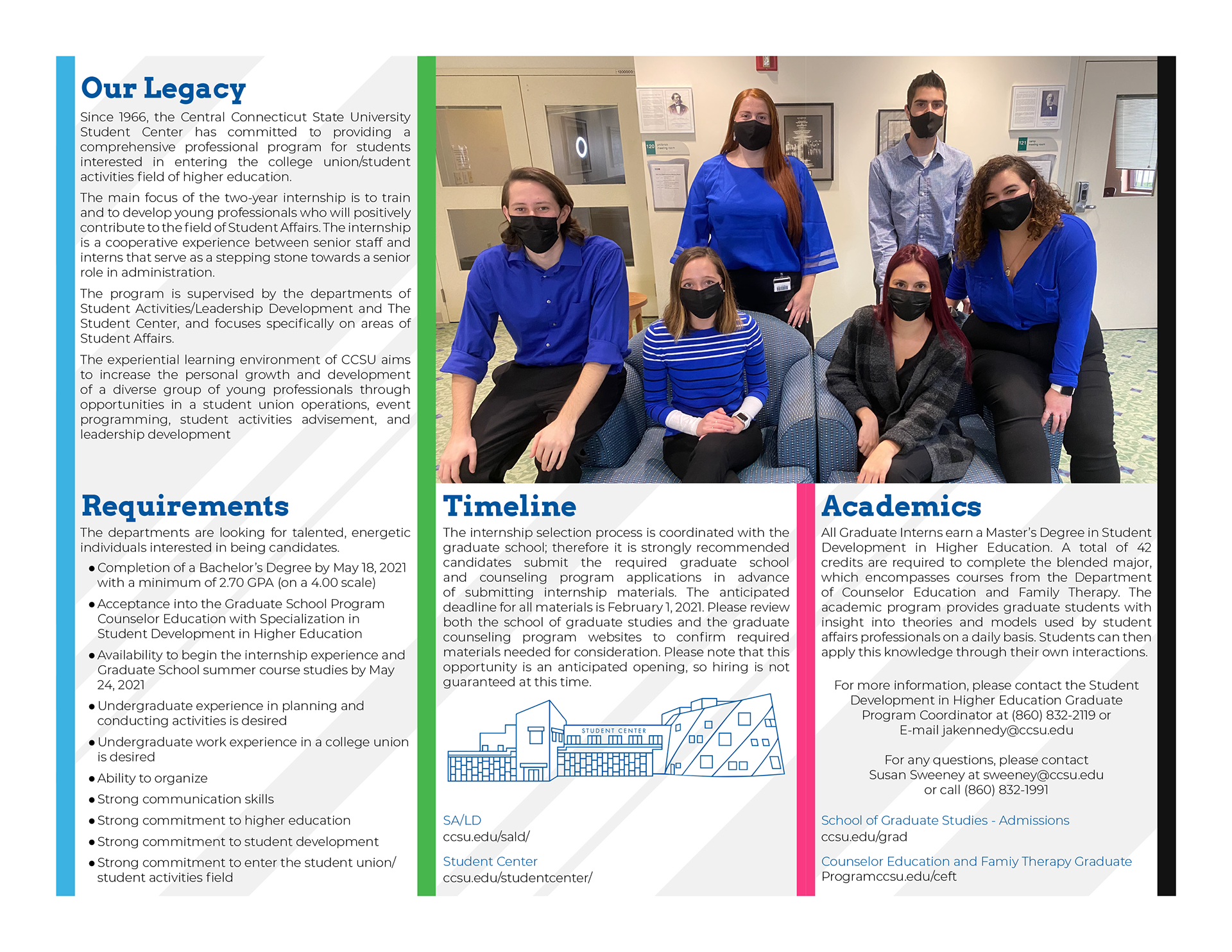
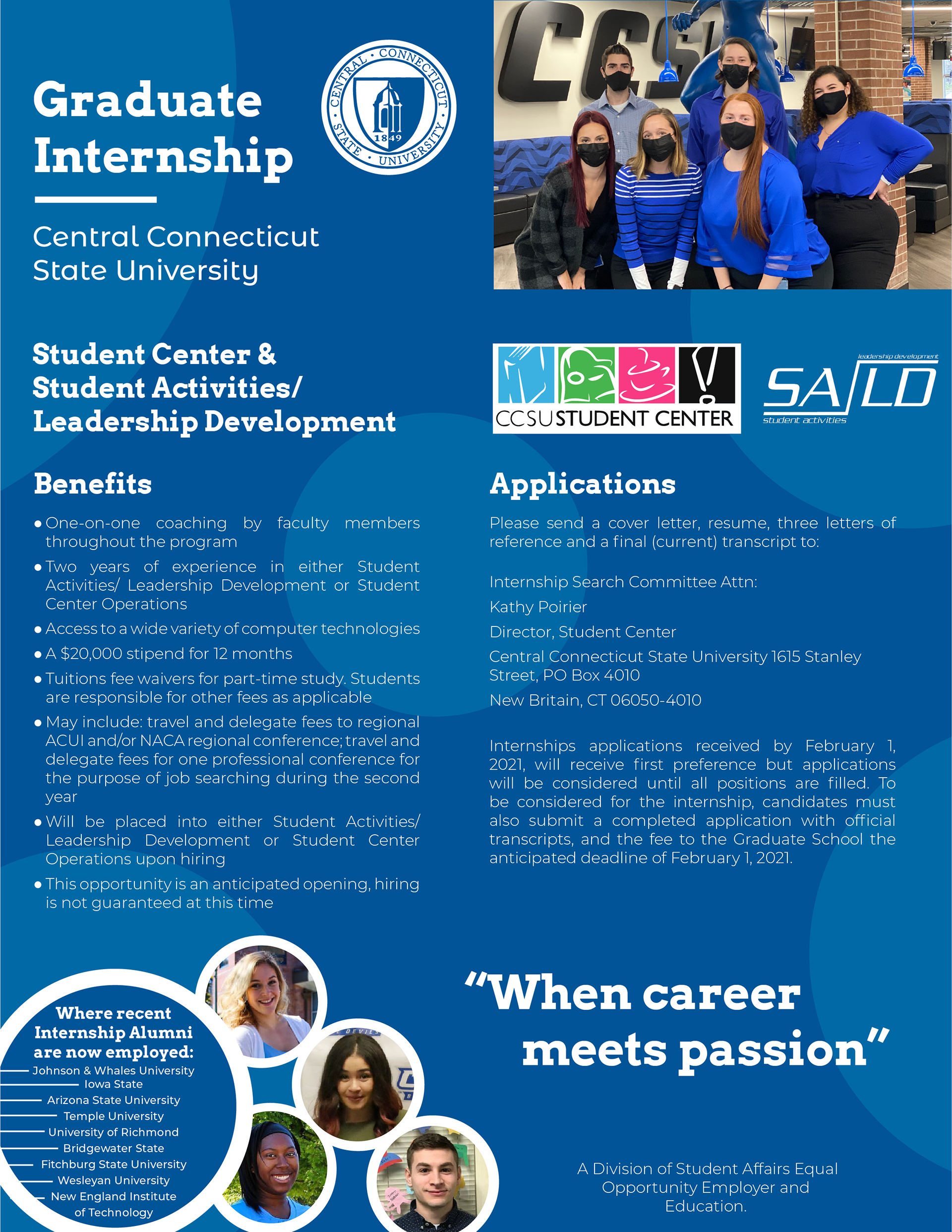
I was tasked with creating a brochure to get people interested in applying for Central Connecticut State University's Graduate Intern program. This is a department I worked very closely with, so I was familiar with the content and people involved.
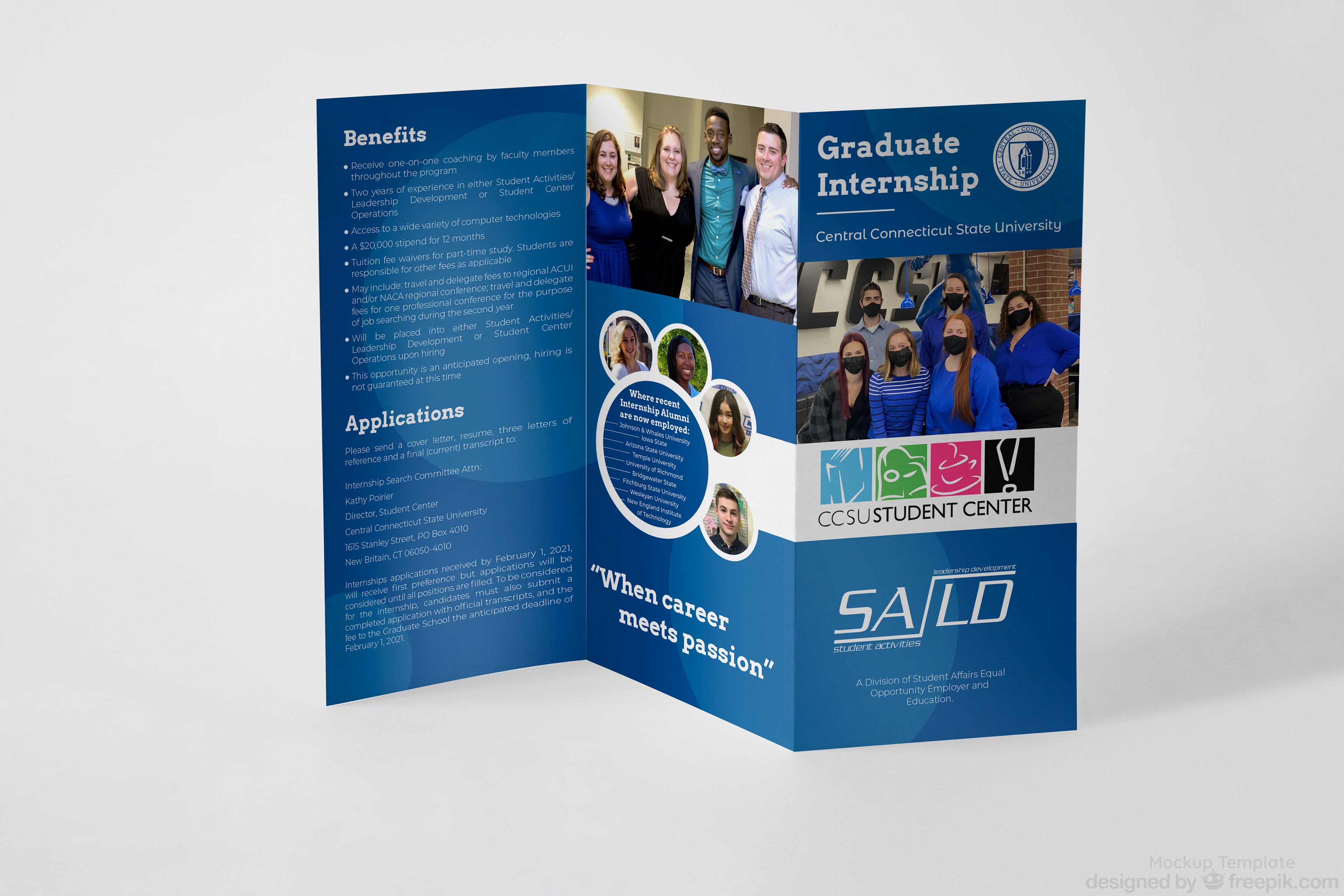
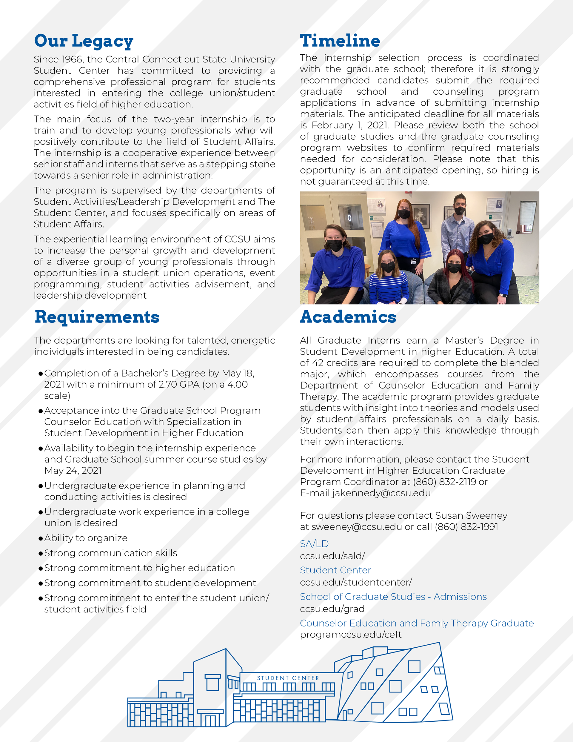
I was given a set of important information that had to be included as well as a large number of photos. For this year's brochure, they had asked me to incorporate past years' interns as well. This allowed me to reach out and find all sorts of friendly faces to include in the imagery. I stuck with the school's color palette for the outside pages, and for the inside which were much more information based I opted for a white and gray background with the gutter space being filled by the CCSU Student Center branded colors.
In a world struck by the COVID-19 pandemic, physical brochures are not always the best way to get information out. To accompany the brochure, I adapted the information and design to fit a web version which would be emailed out and posted online as well. For this version I made sure to keep a very similar visual style and was able to seamlessly transition all of the information and components to the web format.
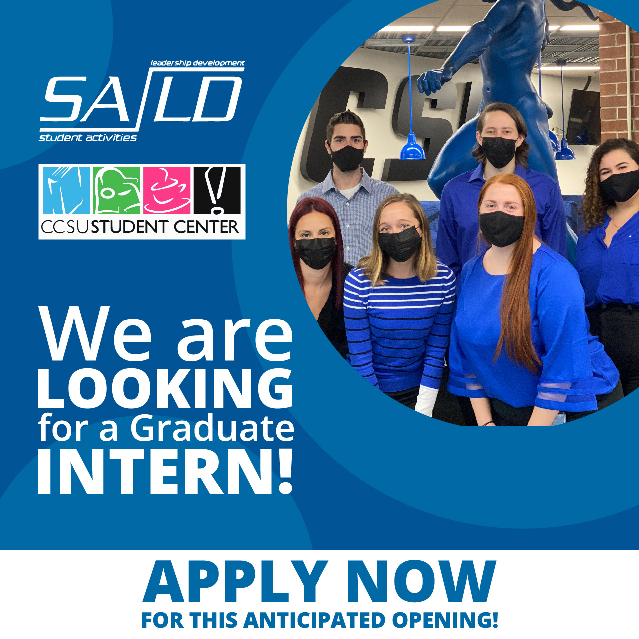

Finally, I created Instagram advertisements for the program as well. This is becoming and increasingly prominent way to reach people of all ages. If done correctly, you can get instant results from Instagram. This was my hope. I kept to the same visual style, only adapted to focus on eye-catching forms and type, with a large image and an "APPLY NOW" banner at the bottom.
Keeping a strong visual style consistent between different platforms is very important to brand recognition. Ideally, you always want people to know exactly who is posting what they are seeing. If people can recognize a brand by your colors and visual style, then I feel you have truly succeeded in establishing a strong brand design.
These posts were created using Adobe Photoshop, Adobe Illustrator, and Adobe InDesign.