

Done with Adobe Dreamweaver, Adobe Illustrator, and Adobe Photoshop.
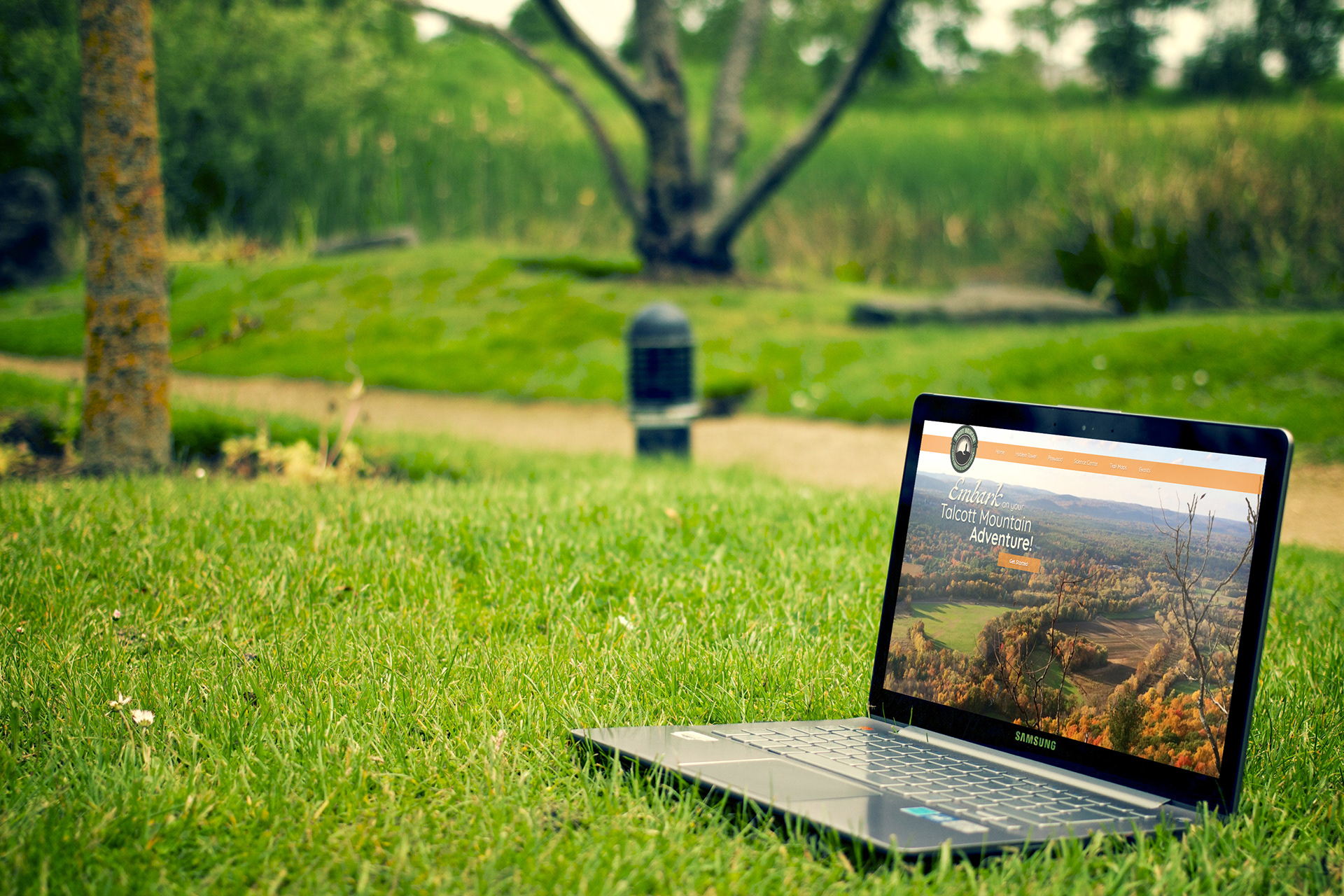
The objective was to create a website for Talcott Mountain State Park that could link to it’s three prominent locations. Research was done by looking into the designs of websites belonging to other state parks, and my goal was to create a site that would be intuitive, responsive, and feel like you’re diving into the heart of Talcott Mountain just by visiting the site.
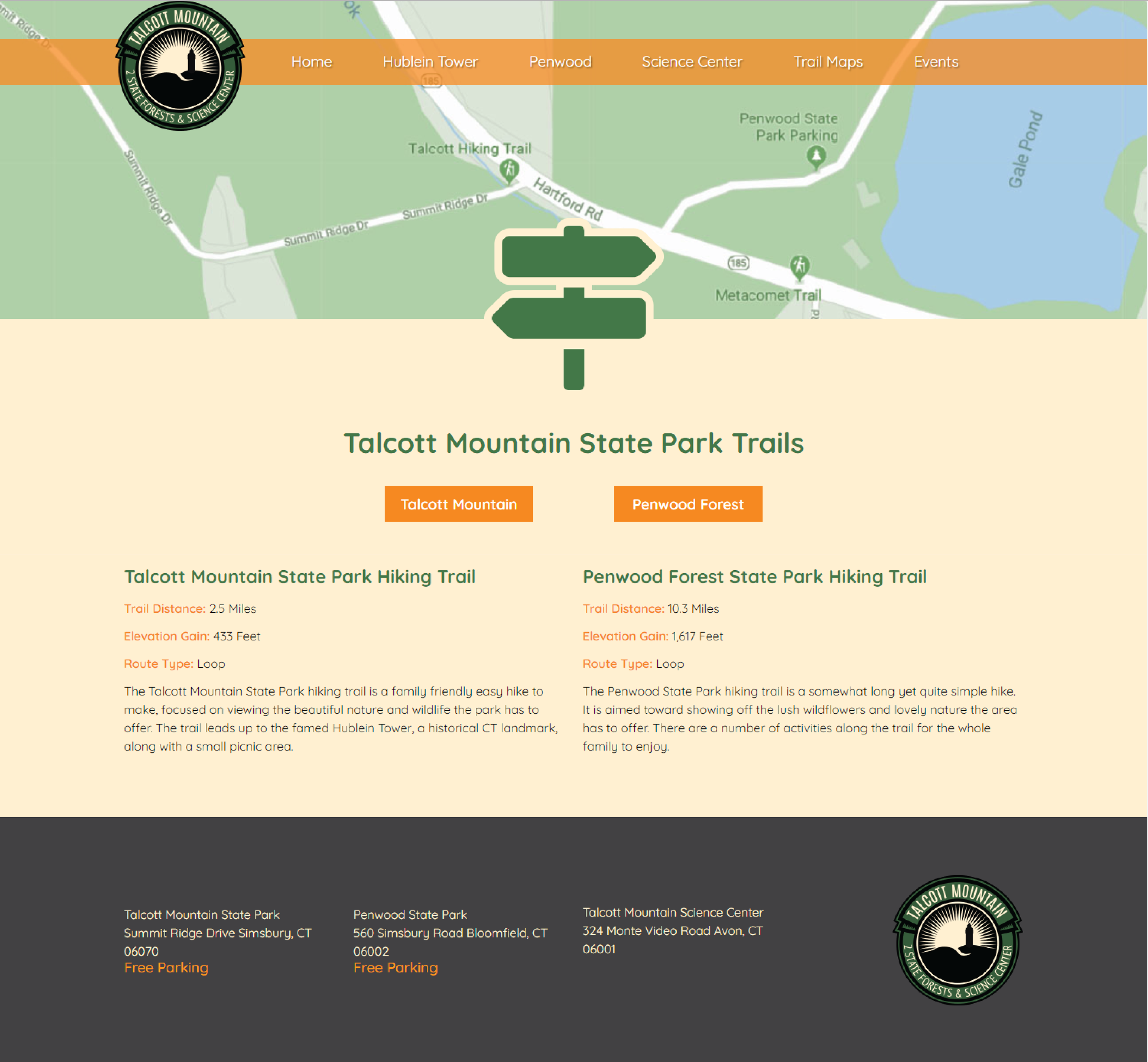
Below is an example of an interior page. This is the Trails page, which shows the user the available trails as well as some important information and links to download the trail maps. This design was made to feel almost like an extension of the home page, so as to keep the user familiar with how the site operates.
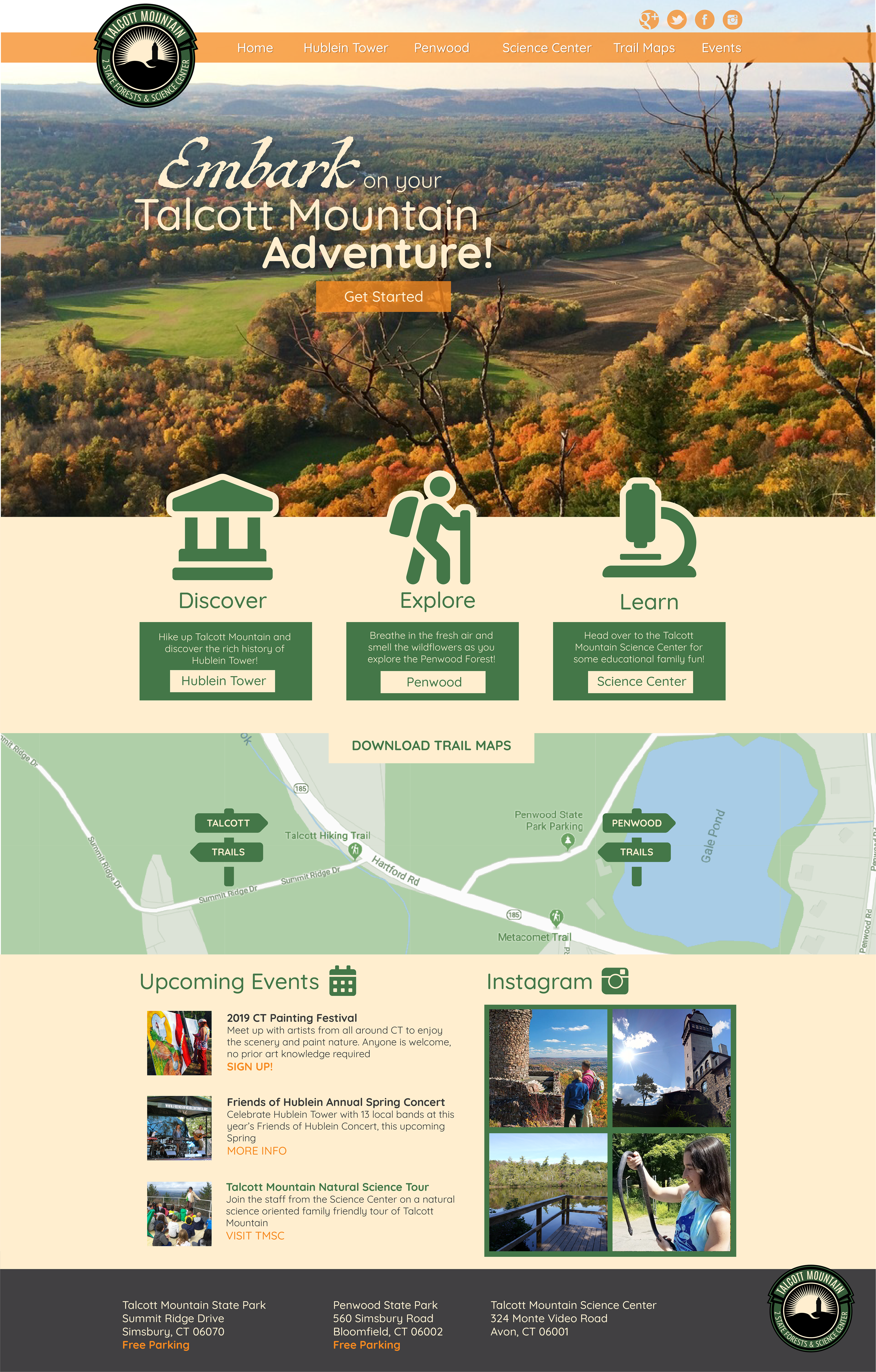
My concept was to create a website that would be able to clearly link to each related location while also serving as a user-friendly and visually pleasing hub for Talcott Mountain related information. I designed the website to have the style of a trail map or trail signs you would see around a state park, using natural looking colors and a lot of iconography. The signage to me is the first thing that stands out with a state park, especially one that has hiking trails. To make this website truly feel like a website suitable to what Talcott Mountain is all about, I felt this was the correct choice. I divided the page into just a few short sections to keep it clear and easy to navigate and read, only giving enough information to get interested parties clicking on what they want to see. This helps keep the website clean and free of clutter, which is very important to a user’s experience. Down the page you will find an events section, which was a necessary inclusion due to the vast amount of events Talcott Mountain holds. Right next to it you will find an Instagram feed showcasing a shot of Hublein Tower. These two were placed next to each other because the most common reasons people go to Talcott Mountain are for events or for a hike with some breathtaking photo opportunities. If these are both right next to each other, people will definitely stay interested. Then finally at the bottom you have the footer, which simply states the addresses of each prominent location as well as whether or not free parking is available, because that is definitely important to people. Overall I feel it is a very user friendly experience with a clear direction and theme.
I was able to advance my knowledge of website building as well as some subtle design principles to think about when designing websites as opposed to print. People look for different things in web design, and this project really helped me realize and be totally mindful of these differences.
Sources:
-Google Map of Talcott Mountain: https://goo.gl/maps/YxE3BH9JMSTTm8in6
-Trail Information supplied by AllTrails.com
-Mockup photos by Picography and Oleg Magni from Pexels.com
-Other photos and Talcott Mountain State Park logo supplied by Professor Tina Rice of Central Connecticut State University