
Wildthings Inc.
Natural Furnishings for the Home
For this project I was tasked with designing the brand for a fictional furniture company known as Wildthings Inc. In order to establish a brand for the company, I had to know a little about them.
I knew they were a Colorado based company, and I knew they were totally invested in using natural materials and being totally in tune with nature. I began to draw connections between nature and the state of Colorado, and naturally I found myself looking at various animals native to the mountains of Colorado. I quickly decided on a buffalo, as they are strong and iconic, and can definitely make a strong logo face. I began sketching numerous drafts using basic shapes and strong design principles.
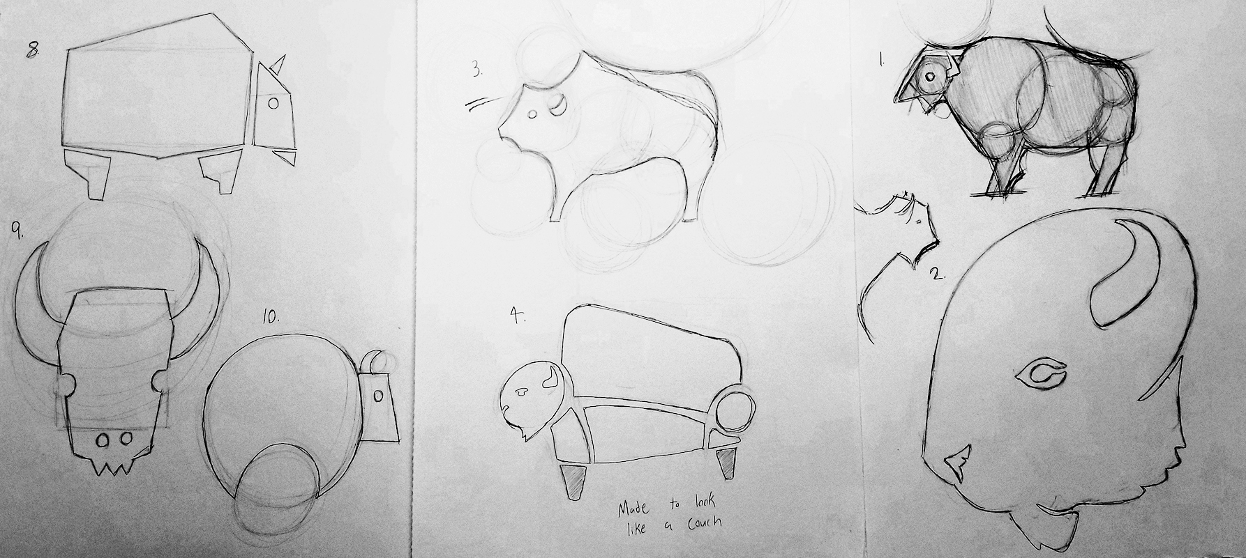
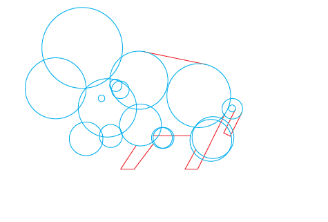
After creating about 10 pencil sketches using basic shapes, I selected which one had the most potential. I felt #3 was very unique and has some really interesting shapes. I scanned it into Adobe Illustrator and began lining up various circle and lines until I got a shape I was happy with. I added a few details to make it feel a little more naturalistic and slick, such as the angled tail and the light strokes on the legs to give it a little more depth.
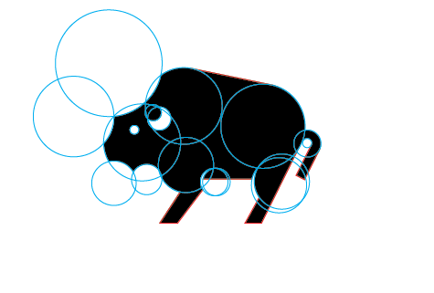
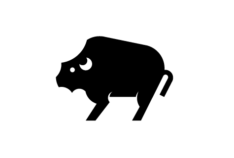
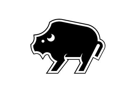
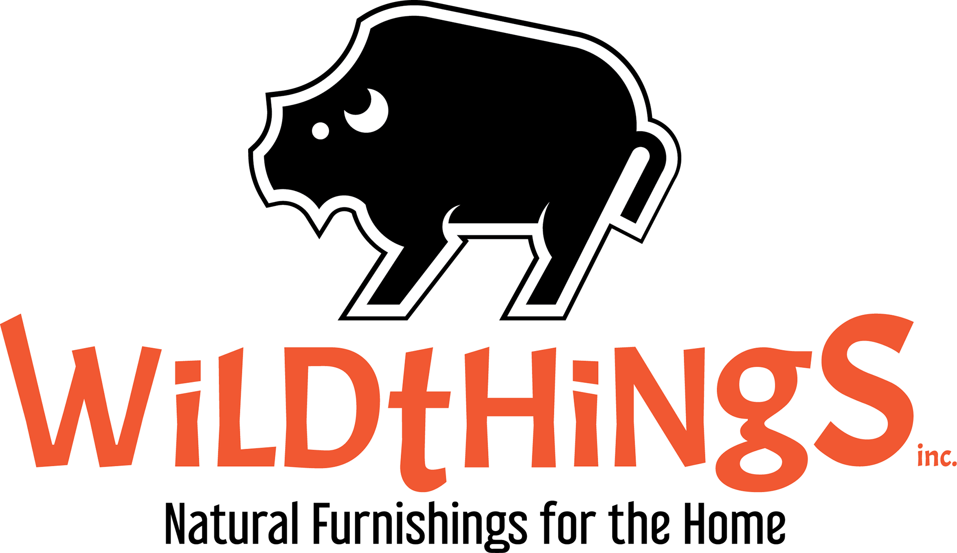
I gave the buffalo a strong white and black outline to allow it to stand out on any background, and I fell in love with it. After that I had to create an appropriate typeface logo to accompany the logo face. I wanted something interesting and wild looking to go with the name, and quickly I found an appropriate typeface. I made some tweaks to the sizing and shape of the type and attached a simpler font for the tagline. The logo was finally complete.
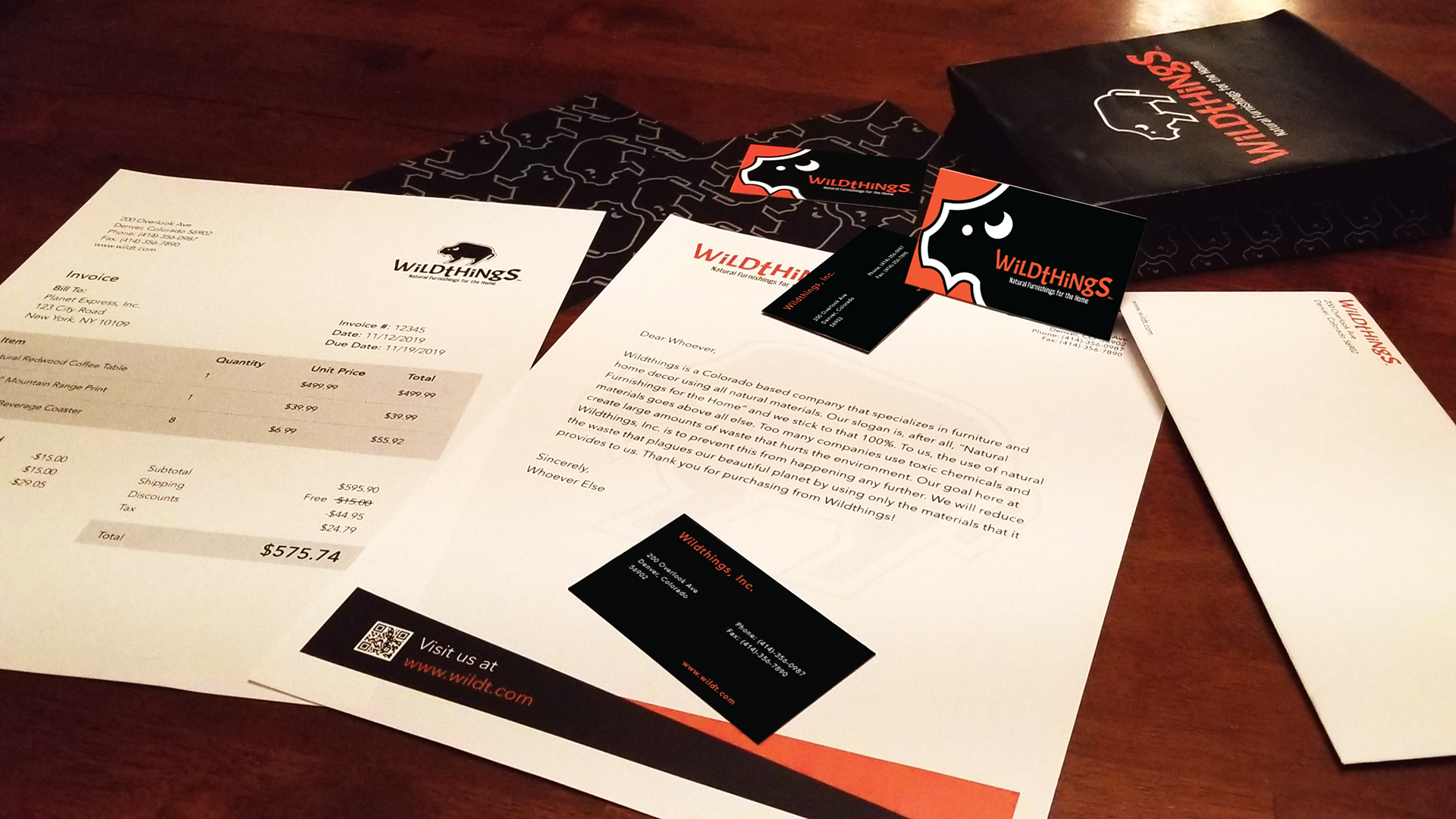
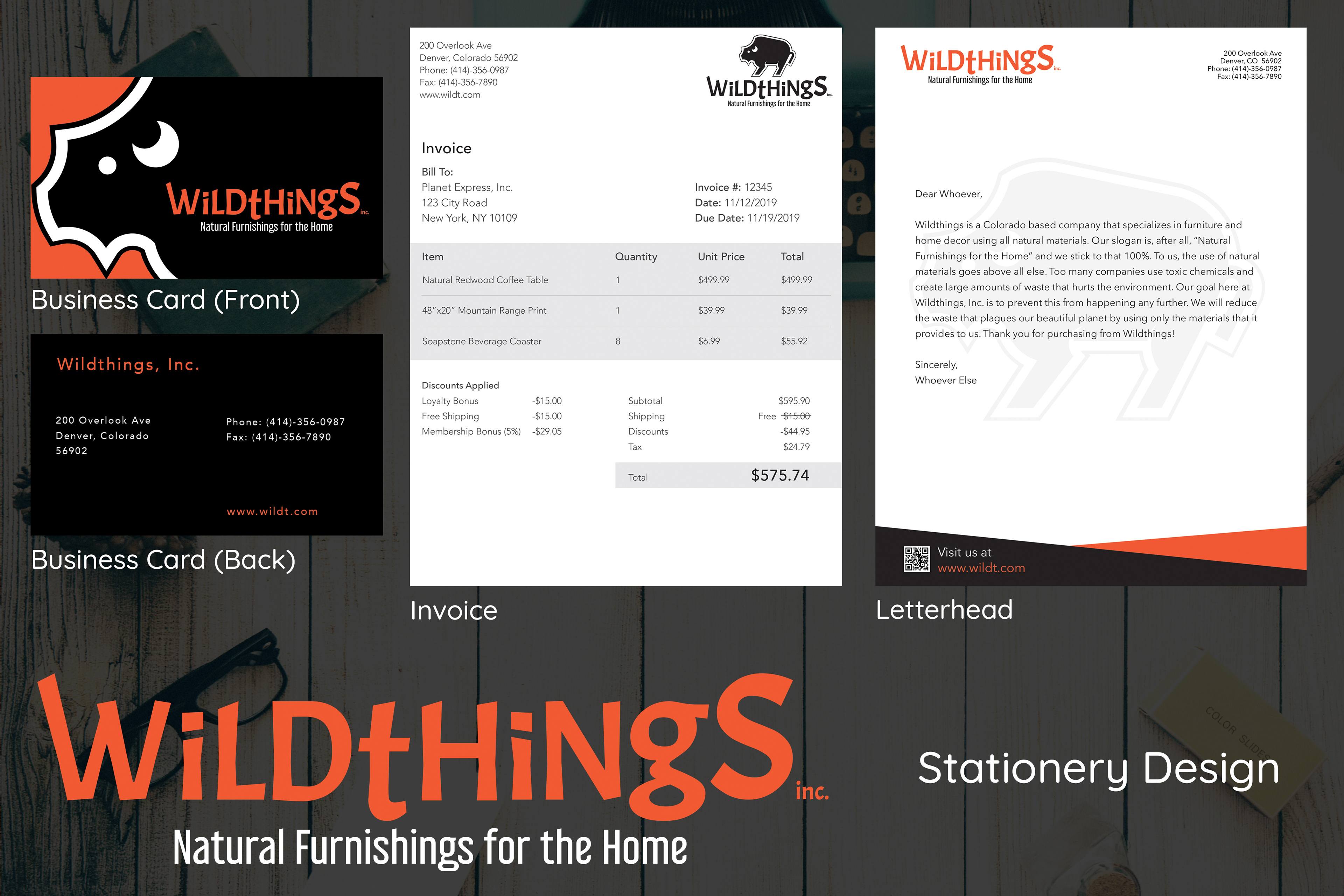
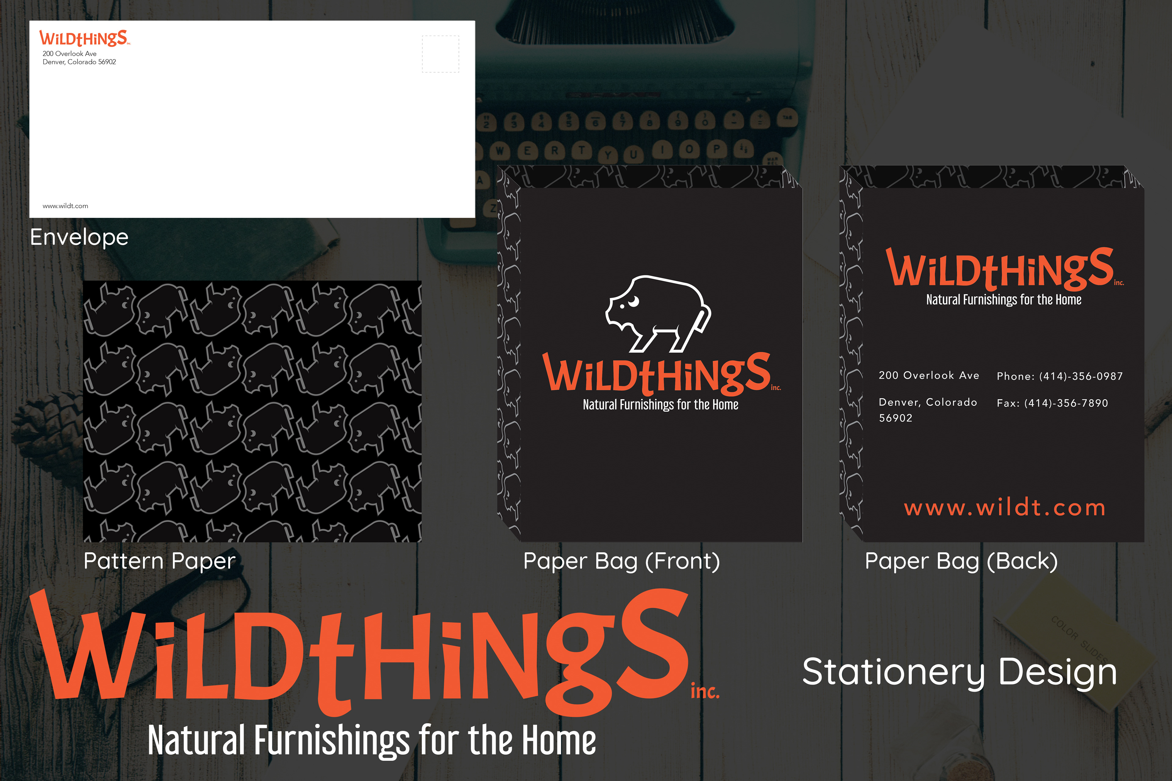
When designing the stationery for the company I wanted to be sure to stick to the same color scheme and overall tone. This is important, as a company always needs a brand. I used sharp edges and the same few colors, along with some well placed buffaloes. At the end of the day it was important to know what had to be on each piece, as this was still a business. They needed to be practical yet appealing designs. The business card used a slightly altered version of the logo, only having the head visible. This allowed space to place the company name and made for a fun and intriguing design. The paper bag had a large logo on the front as well a pattern using alternating buffalo icons. The patterned tissue paper used this same design. For my letterhead, I place a very light watermark of the buffalo logo face as well as a QR code and link to the site at the bottom. The invoice had to be kept simple and readable, as this is a very important document for the customer. It just used simple gray tones to allow for cheap and quick printing, and had everything laid out in a very clean and approachable way. Finally, the envelope just had our logo type and address, the tagline was not necessary.
Below I have a mockup showing all of the physical printed stationery designs, and below that you will find a layout showcasing the digital versions of each design.
Background photo by Dustin Lee on Unsplash, designs created using Adobe Photoshop, Adobe Illustrator, and Adobe InDesign.